
Your website loads slower than a sloth on a Monday morning. And guess what? Google notices. So do your visitors—right before they bounce to your competitor’s site.
Site speed and Core Web Vitals aren’t just fancy metrics anymore. They’re the difference between ranking on page one or drowning in digital obscurity. Google made it crystal clear: fast sites win, slow sites lose.
But here’s the good news. You don’t need a PhD in computer science to fix this. You just need the right roadmap—and that’s exactly what you’re getting today.
Table of Contents
ToggleWhat Are Core Web Vitals and Why Should You Care?
Core Web Vitals are Google’s official speed metrics. Think of them as your website’s health checkup, measuring real user experiences.
Google introduced these metrics in 2021 as part of their page experience signals. They’re not suggestions—they’re ranking factors that directly impact your search visibility and user satisfaction.
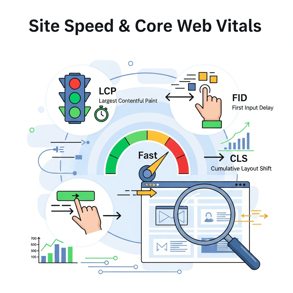
The three main metrics are Largest Contentful Paint (LCP), First Input Delay (FID) (now replaced by Interaction to Next Paint (INP)), and Cumulative Layout Shift (CLS). Master these, and you’re golden.
According to Google’s Web Vitals report, only 43% of websites pass all Core Web Vitals thresholds. That means 57% of your competitors are probably failing—which is your opportunity to dominate.
How Do Core Web Vitals Affect Your Rankings?
Page speed has been a ranking factor since 2010, but Core Web Vitals took it nuclear. Google now measures actual user experience, not just theoretical load times.
A study by Portent found that a site loading in 1 second converts 3x better than one loading in 5 seconds. Every extra second costs you real money and real rankings.
Mobile-first indexing makes this even more critical. Google ranks your site based on mobile performance, so if your mobile speed sucks, your rankings tank across all devices.
Understanding LCP: What Is Largest Contentful Paint?
Largest Contentful Paint measures loading performance. Specifically, it tracks how long your biggest visible element takes to appear on screen.
This could be your hero image, main heading, or video player. Whatever dominates the user’s viewport when they land on your page—that’s your LCP element.
Google wants your LCP under 2.5 seconds. Anything above 4 seconds? You’re in the danger zone, my friend.
Why LCP Matters More Than You Think
LCP directly correlates with perceived speed. Users don’t care about backend processes—they care about seeing content fast.
Research from Akamai shows that a 100-millisecond delay in load time can hurt conversion rates by 7%. Multiply that by thousands of visitors, and you’re bleeding revenue.
Your LCP also affects bounce rate. If visitors see nothing but white screen for 5 seconds, they’re gone before your content even loads.
How to Improve Your LCP Score
First, identify your LCP element using PageSpeed Insights. It’ll tell you exactly what’s slowing you down.
Image optimization is usually the biggest culprit. Compress images using tools like TinyPNG or ShortPixel. Aim for under 100KB per image without sacrificing quality.
Use lazy loading for images below the fold. Your LCP element should load immediately, but everything else can wait.
Pro Tip: Convert images to WebP format. It’s 25-35% smaller than JPEG while maintaining visual quality. WordPress now supports WebP natively.
Remove unnecessary render-blocking resources. Defer JavaScript that isn’t critical for initial page load. Inline critical CSS to speed up first paint.
Upgrade your web hosting. Cheap shared hosting might save $5/month, but it’ll cost you hundreds in lost conversions. Consider managed WordPress hosting or cloud solutions.
Implement a Content Delivery Network (CDN). Services like Cloudflare or BunnyCDN serve content from servers closest to your users, dramatically reducing load times globally.
🚀 Site Speed & Core Web Vitals Workflow
Interactive optimization roadmap for better rankings & UX
📖 Legend & Color Guide
What Is First Input Delay (FID) and Interaction to Next Paint (INP)?
First Input Delay measured responsiveness—how quickly your site reacts when users click, tap, or interact. Google recently replaced FID with INP (Interaction to Next Paint) for more comprehensive measurement.
INP tracks all interactions throughout the page lifecycle, not just the first one. It’s a tougher metric but more representative of real user experience.
Google wants INP under 200 milliseconds. Anything above 500ms means your site feels sluggish and unresponsive.
Why Interactivity Kills User Experience
Nothing frustrates users more than clicking a button and watching nothing happen. They’ll mash that button 47 times before rage-quitting to Amazon.
Poor interactivity often stems from JavaScript bloat. Heavy scripts block the main thread, preventing the browser from responding to user input.
Third-party scripts are notorious offenders. Every social widget, chat plugin, and analytics tracker adds processing overhead that delays interactions.
How to Fix INP and Improve Responsiveness
Audit your JavaScript using Chrome DevTools. Identify long tasks (anything over 50ms) that block the main thread.
Code splitting helps enormously. Break large JavaScript bundles into smaller chunks that load on demand. Your users don’t need your entire JavaScript library upfront.
Minimize third-party scripts. Do you really need 14 different tracking pixels? Each one slows your site. Consolidate or eliminate what you don’t absolutely need.
Use web workers for heavy computations. They run JavaScript in background threads without blocking user interactions.
Pro Tip: Implement prefetching and preloading for critical resources. This tells browsers to fetch important files before users need them, improving perceived responsiveness.
Defer non-critical JavaScript. Use the defer or async attributes to prevent scripts from blocking page rendering and interaction.
Upgrade to modern frameworks that handle interactions efficiently. React 18, Vue 3, and Svelte offer significant performance improvements over older versions.
Cumulative Layout Shift: Stop the Annoying Content Jumping
Cumulative Layout Shift (CLS) measures visual stability. It tracks unexpected layout shifts that make content jump around while loading.
You know that moment when you’re about to click a link and BAM—an ad loads above it, making you click something else? That’s CLS ruining lives.
Google wants CLS under 0.1. Anything above 0.25 means your layout shifts more than a yoga instructor on Red Bull.
What Causes Layout Shift Issues?
Images without dimensions are the #1 culprit. When browsers don’t know image sizes upfront, they can’t reserve space, causing content to shift when images load.
Web fonts loading late trigger shifts. Your text appears in fallback fonts, then suddenly swaps to your custom font, pushing everything around.
Dynamic content like ads, embeds, and injected widgets often lack proper spacing. They pop in randomly, shoving existing content up or down.
How to Eliminate Layout Shift
Always specify image and video dimensions in HTML. Use width and height attributes so browsers reserve space before loading.
<img src="image.jpg" width="800" height="600" alt="description">
For responsive images, use CSS aspect-ratio to maintain proportions across different screen sizes:
img {
  max-width: 100%;
  height: auto;
  aspect-ratio: 16 / 9;
}
Preload critical fonts and use font-display: swap to prevent invisible text. This shows fallback fonts immediately while loading custom fonts.
Reserve space for dynamic content. If ads or widgets have known dimensions, use CSS min-height to hold their spot.
Pro Tip: Avoid inserting content above existing content unless it’s in response to user interaction. New content should slide in without pushing visible content around.
Test your CLS using the Layout Shift GIF Generator in Chrome DevTools. It visualizes exactly where and when shifts occur.
Use CSS transforms instead of changing layout properties. Transforms don’t trigger layout recalculation, preventing shifts.
Image Optimization: Your Secret Weapon for Faster Load Times
Images account for over 50% of average page weight. Optimize them properly, and you’ll see dramatic speed improvements.
Compression reduces file size without noticeable quality loss. Tools like ImageOptim, Squoosh, or TinyPNG can shrink images by 70-80%.
Choose the right image format. WebP beats JPEG and PNG for most use cases. AVIF is even better but has limited browser support currently.
Modern Image Formats Explained
JPEG works great for photographs but lacks transparency support. Use quality settings between 75-85 for the sweet spot between size and quality.
PNG handles transparency and graphics with sharp edges. But file sizes balloon quickly—use it sparingly.
WebP delivers superior compression with transparency support. It’s 25-35% smaller than equivalent JPEG files and supported in all modern browsers.
AVIF offers even better compression but browser support is still catching up. Use it with WebP fallback for progressive enhancement.
Responsive Images and Srcset
Serving desktop-sized images to mobile users wastes bandwidth and slows load times. Responsive images solve this elegantly.
Use the srcset attribute to provide multiple image sizes:
<img src="image-800.jpg"
     srcset="image-400.jpg 400w,
             image-800.jpg 800w,
             image-1200.jpg 1200w"
     sizes="(max-width: 600px) 400px,
            (max-width: 900px) 800px,
            1200px"
     alt="description">
Browsers automatically select the appropriate image based on screen size and device pixel ratio. Users get optimized images without extra work from you.
WordPress handles responsive images automatically for uploaded media. But double-check your theme and page builder actually use them.
Lazy Loading: Load Images Only When Needed
Lazy loading defers loading images until they’re about to enter the viewport. Why load images users might never see?
Native lazy loading is now supported in all modern browsers. Just add the loading="lazy" attribute:
<img src="image.jpg" loading="lazy" alt="description">
This simple attribute can cut initial page load by 40-50% for image-heavy pages. It’s almost too easy.
When to Use (and Not Use) Lazy Loading
Never lazy load your LCP element or above-the-fold images. They need to load immediately for optimal perceived performance.
Lazy loading works brilliantly for long-form content, image galleries, and any images below the fold. Users scrolling down don’t notice the delay.
For critical images, use loading="eager" to explicitly load them immediately. This prevents browsers from making wrong guessing decisions.
Pro Tip: Combine lazy loading with low-quality image placeholders (LQIP). Show blurred versions instantly while full images load, improving perceived performance.
Monitor lazy loading impact with Google Analytics. Track scroll depth to see if users actually reach those lazy-loaded images.
Don’t lazy load everything blindly. Test different thresholds using Intersection Observer API for fine-tuned control over when images start loading.
Browser Caching: Make Return Visits Lightning Fast
Browser caching stores static files locally so repeat visitors load pages instantly. It’s free speed that too many sites ignore.
Configure caching through HTTP headers that tell browsers how long to store files. Set long expiration times for resources that rarely change.
Proper caching reduces server load, bandwidth costs, and load times. It’s literally the easiest performance win available.
How to Implement Effective Caching
Add cache-control headers to your .htaccess file (Apache) or server configuration:
<IfModule mod_expires.c>
  ExpiresActive On
  ExpiresByType image/jpg "access plus 1 year"
  ExpiresByType image/jpeg "access plus 1 year"
  ExpiresByType image/png "access plus 1 year"
  ExpiresByType image/webp "access plus 1 year"
  ExpiresByType text/css "access plus 1 month"
  ExpiresByType application/javascript "access plus 1 month"
  ExpiresByType text/javascript "access plus 1 month"
</IfModule>
WordPress caching plugins like WP Rocket, W3 Total Cache, or LiteSpeed Cache handle this automatically with additional optimizations.
Use versioned filenames for assets that change. Instead of style.css, use style.v2.css to force browsers to fetch updated versions.
Cache Invalidation Strategies
The hardest problem in computer science: cache invalidation and naming things. When you update files, cached versions need to refresh.
Cache busting appends query strings or changes filenames when files update. Build tools can automate this process.
For dynamic content, use shorter cache times. Blog posts might cache for 1 hour, while static assets cache for 1 year.
Pro Tip: Implement ETags for dynamic resources. They let browsers validate cached copies without re-downloading unchanged content.
Test caching effectiveness using GTmetrix or WebPageTest. Look for “Leverage browser caching” recommendations.
Balance cache duration against update frequency. Longer caching means better performance but potentially stale content if you update files.
CDN Usage: Serve Content from Everywhere
Content Delivery Networks distribute your content across global servers. Users load files from the closest location, dramatically reducing latency.
Cloudflare offers a generous free tier that speeds up sites worldwide. Premium CDNs like Fastly, KeyCDN, or BunnyCDN provide even better performance.
CDNs reduce load on your origin server, improve reliability, and provide DDoS protection as bonus features.
How CDNs Improve Core Web Vitals
Geographic distance matters. A user in Tokyo loading files from a New York server faces 200ms latency minimum—just from distance.
CDNs cache content on edge servers worldwide. That Tokyo user now loads from a local server with 5ms latency. That’s a 40x improvement.
This directly impacts your LCP and overall load times. Faster server response means faster content delivery and happier users.
Choosing the Right CDN
Free options like Cloudflare work great for most sites. They offer unlimited bandwidth and basic optimizations without cost.
BunnyCDN provides excellent performance at low cost ($1/TB bandwidth). It’s perfect for mid-sized sites with growing traffic.
Enterprise sites need enterprise CDNs. Fastly, Akamai, or AWS CloudFront offer advanced features, but complexity and cost increase dramatically.
Pro Tip: Enable HTTP/3 (QUIC protocol) on your CDN for faster connection establishment and improved performance on mobile networks.
Integrate your CDN with your caching plugin. Most WordPress caching solutions offer one-click CDN integration for seamless implementation.
Test CDN performance from multiple locations using tools like KeyCDN’s Performance Test. Verify improvements across different geographic regions.
Minifying CSS and JavaScript: Trim the Fat
Minification removes unnecessary characters from code—spaces, comments, line breaks—without changing functionality. Your code works identically but downloads 30-40% faster.
Whitespace and formatting make code readable for humans. Computers don’t care. Strip it out for production.
Modern build tools handle minification automatically. But if you’re running WordPress, plugins make it dead simple.
Minification Best Practices
Never minify your development files. Keep readable versions for editing and debugging. Only serve minified versions to users.
Use automated build processes with tools like webpack, Gulp, or Vite. They minify during compilation, ensuring production code is always optimized.
WordPress users should try WP Rocket or Autoptimize. They minify and combine files automatically without touching your source code.
Combining vs. Splitting Files
Old advice said combine everything into single files. Modern best practice? It depends on HTTP version.
HTTP/2 and HTTP/3 handle multiple small files efficiently. File combination can actually hurt performance by preventing parallel downloads and breaking caching.
Test both approaches. Combine files if using HTTP/1.1. Split files when using HTTP/2+ for better caching and parallel loading.
Pro Tip: Remove unused CSS using PurgeCSS or similar tools. Most themes include framework CSS you never use—purging can reduce stylesheet size by 90%.
Minify inline JavaScript and CSS too. Those <script> and <style> blocks in your HTML also benefit from compression.
Monitor minification errors. Occasionally, aggressive minification breaks functionality. Test thoroughly and exclude problematic files if needed.
Mobile Speed Optimization: Win the Mobile-First Race
Google’s mobile-first indexing means mobile performance determines your rankings. Desktop speed is secondary now.
Mobile networks are slower and less reliable than broadband. Mobile devices have less processing power. Your optimization needs mobile-first thinking.
According to Statista, over 60% of web traffic comes from mobile devices. Ignore mobile optimization at your own peril.
Mobile-Specific Performance Challenges
Network latency on 4G/5G still exceeds broadband. Even fast mobile connections face higher round-trip times and packet loss.
CPU limitations on smartphones mean JavaScript execution takes longer. Complex scripts that run smoothly on desktop crawl on mobile.
Battery constraints make users sensitive to resource-heavy sites. Power-hungry sites drain batteries fast, creating negative user experiences.
Optimizing for Mobile Performance
Reduce JavaScript execution. Mobile CPUs process JavaScript 3-5x slower than desktop processors. Every kilobyte of JavaScript hurts mobile users more.
Prioritize critical rendering path for mobile. Above-the-fold content must load instantly. Everything else can wait.
Test on real devices, not just emulators. Chrome DevTools helps, but nothing beats testing on actual phones with real network conditions.
Pro Tip: Use Google’s Lighthouse in mobile mode to test performance. It throttles CPU and network to simulate mid-range devices on 4G connections.
Implement adaptive loading based on network conditions. Serve lower-quality images or reduced functionality to users on slow connections.
Consider AMP (Accelerated Mobile Pages) for content-heavy sites. While controversial, AMP ensures blazing fast mobile experiences for Google Search traffic.
Core Web Vitals Tools: Measure Before You Optimize
You can’t improve what you don’t measure. These tools reveal exactly where your performance problems hide.
Google PageSpeed Insights is your starting point. It provides Core Web Vitals scores plus specific recommendations for improvement.
Chrome DevTools offers deep diagnostic capabilities. The Performance and Lighthouse panels show detailed performance breakdowns and optimization opportunities.
Essential Performance Testing Tools
PageSpeed Insights combines lab data (synthetic testing) with field data (real user metrics). Both matter.
Lab data shows what’s possible under controlled conditions. It’s perfect for testing changes during development.
Field data from Chrome User Experience Report (CrUX) shows real-world performance. This is what actually affects your rankings.
Advanced Performance Monitoring
GTmetrix provides detailed waterfall charts and historical tracking. Monitor performance over time to catch regressions quickly.
WebPageTest offers advanced testing options—different locations, devices, connection speeds. It’s like a performance testing Swiss Army knife.
Real User Monitoring (RUM) tools like SpeedCurve or Request Metrics track actual user experiences. They catch issues synthetic tests miss.
Interpreting Performance Data
Focus on field data first. Synthetic tests show potential; field data shows reality. Your real users’ experiences matter most.
Compare your site to competitors. Tools like HTTP Archive show industry benchmarks. Are you faster or slower than average?
Monitor performance over time. One-time tests miss trends. Regular monitoring catches performance degradation before it tanks your rankings.
Pro Tip: Set up automated performance monitoring with alerts. Get notified when Core Web Vitals scores drop below thresholds so you catch problems immediately.
Test from multiple geographic locations. Performance varies dramatically based on server proximity and network infrastructure.
Don’t obsess over perfect scores. Focus on passing thresholds and continuous improvement. A site scoring 85 that loads fast beats a 100-scoring site that feels slow.
Page Speed Testing: Beyond the Basics
Running a single speed test tells you almost nothing. Performance varies by location, device, time of day, and user network conditions.
Comprehensive testing requires multiple tests from different scenarios. Your New York office has gigabit fiber—your customers in rural areas don’t.
Test on different devices and networks. Desktop on fiber, mobile on 4G, and mobile on slow 3G all show different bottlenecks.
Setting Up Meaningful Tests
Use WebPageTest for detailed analysis. Set location to match your target audience. Test on actual mobile devices, not desktop emulations.
Run multiple tests and average results. A single test can be misleading due to network variance or server conditions.
Test your most important pages—homepage, key landing pages, product pages, blog posts. Each page type has different optimization needs.
Understanding Waterfall Charts
Waterfall charts visualize resource loading sequence. They show exactly what loads when and what blocks what.
Look for long horizontal bars—those are your problem resources. Focus optimization efforts on the slowest-loading assets.
Identify blocking resources shown in orange or red. These prevent page rendering and should be eliminated or deferred.
Pro Tip: Use the filmstrip view in WebPageTest to see what users actually see during loading. It reveals perceived performance issues not obvious in raw numbers.
Compare before and after waterfall charts when implementing optimizations. Visual proof of improvements helps justify optimization efforts.
Export and share test results with your development team. Detailed data helps developers understand and prioritize performance issues.
Server Response Time: The Foundation of Speed
Your server response time (TTFB – Time to First Byte) is the foundation everything else builds on. Fast servers enable fast sites.
Google wants TTFB under 600ms. Anything above 1 second means your server struggles under load or your hosting sucks.
No amount of front-end optimization fixes slow servers. You can’t polish a turd—you need better hosting.
What Affects Server Response Time
Shared hosting is the cheapest option and usually the slowest. You share resources with hundreds of sites, so performance suffers.
Database queries often bottleneck server response. Poorly optimized queries or missing indexes can add seconds to response times.
Server location relative to users matters. A server in Europe serves European users faster than one in Australia.
Improving Server Performance
Upgrade to managed WordPress hosting like Kinsta, WP Engine, or Cloudways. Optimized server stacks dramatically improve response times.
Implement object caching with Redis or Memcached. This stores database query results in memory, eliminating redundant database hits.
Database optimization reduces query times. Delete post revisions, clean transients, and index frequently queried columns.
Server-Side Caching Strategies
Page caching serves pre-generated HTML instead of processing PHP for every request. This reduces server processing by 90%+.
Opcode caching with OPcache stores compiled PHP code in memory. This eliminates PHP compilation overhead on each request.
Use full-page caching for logged-out users. Only dynamic, personalized content needs real-time processing.
Pro Tip: Implement critical CSS and server-side rendering for instant first paint. Users see content immediately while the full page loads in background.
Monitor server performance with tools like New Relic or Scout APM. They identify slow queries and bottlenecks in your application code.
Consider static site generation for content-heavy sites. Tools like Gatsby or Next.js pre-render pages at build time, serving static HTML for maximum speed.
Common Core Web Vitals Mistakes to Avoid
Mistake #1: Optimizing only for desktop. Mobile-first indexing means mobile performance determines rankings—desktop is secondary.
Mistake #2: Ignoring field data. Synthetic tests show potential, but real user metrics from Search Console show reality.
Mistake #3: Over-optimizing for perfect scores. Passing thresholds matters—getting 100 instead of 95 rarely impacts rankings or user experience.
More Performance Pitfalls
Adding too many plugins kills WordPress performance. Every plugin adds queries, scripts, and overhead. Audit ruthlessly and delete what you don’t absolutely need.
Not testing after updates. Theme updates, plugin updates, and WordPress updates can introduce performance regressions. Test after every major change.
Implementing conflicting optimizations. Multiple caching plugins, competing lazy loading scripts, and redundant minification can actually hurt performance.
Optimization Theater vs. Real Improvements
Optimization theater means chasing metrics without improving user experience. Don’t minify 5KB scripts while ignoring 5MB images.
Focus on impact-to-effort ratio. Image optimization gives massive gains for minimal effort. Rewriting your entire codebase for 5% improvement isn’t worth it.
User-centric metrics matter most. If users experience your site as fast, you’re winning—even if synthetic tests show room for improvement.
Pro Tip: Implement performance budgets for your site. Set maximum file sizes and loading times that new features can’t exceed without explicit approval.
Don’t sacrifice functionality for speed. A slightly slower site that converts better beats a lightning-fast site that doesn’t meet user needs.
Monitor business metrics alongside technical metrics. Track how performance changes affect bounce rate, conversions, and revenue—not just PageSpeed scores.
Performance Optimization Comparison Table
| Optimization | Impact | Difficulty | Cost | Priority |
|---|---|---|---|---|
| Image Compression | High | Easy | Free | Critical |
| Lazy Loading | High | Easy | Free | Critical |
| Browser Caching | High | Medium | Free | High |
| CDN Implementation | High | Easy | $0-50/mo | High |
| Minification | Medium | Easy | Free | Medium |
| Server Upgrade | High | Easy | $20-100/mo | High |
| Database Optimization | Medium | Medium | Free | Medium |
| Font Optimization | Medium | Easy | Free | Medium |
| Code Splitting | Medium | Hard | Free | Low |
| AMP Implementation | Medium | Hard | Free | Low |
How Technical SEO Connects to Core Web Vitals
Technical SEO provides the foundation for performance optimization. You can’t achieve great Core Web Vitals without solid technical fundamentals.
Structured data, proper HTML semantics, and clean code architecture all contribute to faster, more efficient sites.
Your technical SEO strategy should integrate performance from the ground up. Speed isn’t separate from SEO—it’s a critical component.
Building Performance into Your SEO Strategy
Site architecture affects performance. Flat architecture with fewer clicks requires less processing and loads faster than deeply nested structures.
Clean code loads faster and renders more efficiently. Bloated, poorly structured HTML and CSS slow everything down.
Mobile-responsive design isn’t just about layout—it’s about delivering appropriately sized resources and optimized experiences for mobile networks.
Internal linking strategies can improve or hurt performance. Excessive footer links and navigation menus add processing overhead without SEO benefit.
Frequently Asked Questions
What’s the most important Core Web Vital to optimize first?
LCP typically has the biggest impact and is often easiest to improve. Start with image optimization and server response time. Once LCP is passing, tackle INP and CLS. Focus on the metric failing hardest first—fixing one poor metric helps rankings more than perfecting already-good metrics.
Do Core Web Vitals affect mobile and desktop rankings differently?
Yes. Mobile-first indexing means mobile Core Web Vitals primarily determine rankings for all devices. Desktop performance still matters for desktop user experience, but Google ranks based on mobile metrics. Prioritize mobile optimization—it affects everything.
How long does it take for Core Web Vitals improvements to affect rankings?
Google needs 28 days of field data to update Core Web Vitals status in Search Console. After improvements, expect 4-8 weeks before seeing ranking impacts. Performance improvements affect user experience immediately, but ranking changes lag behind actual performance gains.
Can I pass Core Web Vitals on cheap shared hosting?
Difficult but possible for small, well-optimized sites. Shared hosting limits make passing thresholds challenging under load. Budget at least $20-30/month for managed WordPress hosting or VPS if Core Web Vitals matter for your rankings and revenue.
Should I use AMP to improve Core Web Vitals?
AMP guarantees fast mobile experiences but limits functionality and design flexibility. Modern optimization techniques can achieve similar speeds without AMP restrictions. Consider AMP for news or content-heavy sites where speed trumps everything else.
How do third-party scripts affect Core Web Vitals?
Third-party scripts destroy performance—analytics, ads, social widgets, chat plugins all add processing overhead. Audit every third-party script, delay non-critical scripts, and eliminate unnecessary ones. Each script you remove improves Core Web Vitals significantly.
Final Thoughts: Speed Is Your Competitive Advantage
Site speed and Core Web Vitals separate winners from losers in search results. Google made page experience a ranking factor because fast sites serve users better.
Your competitors are probably ignoring this. Most sites fail Core Web Vitals thresholds, creating massive opportunities for sites that optimize properly.
Start with high-impact, low-effort optimizations—image compression, lazy loading, caching, CDN. Knock out quick wins first, then tackle harder optimizations.
Performance optimization isn’t one-time work. Monitor regularly, test after updates, and continuously improve. Fast sites stay fast through vigilant maintenance.
The best part? These optimizations don’t just help rankings—they increase conversions, reduce bounce rates, and improve user satisfaction. Speed pays for itself.
Stop treating performance as technical debt. Make it a competitive advantage. Your rankings, your users, and your revenue will thank you.
Now go make your site fast. The slow sites won’t know what hit them.