Your blog post has 3,000 words and exactly one stock photo of someone typing on a laptop. Congratulations—you’ve just created a wall of text that makes college textbooks look exciting.
Or maybe you went the opposite direction: twelve images crammed into 400 words of fluff. Now your page looks like a Pinterest board threw up.
Both approaches murder user engagement faster than autoplay videos with sound.
The image to text ratio SEO debate isn’t about arbitrary rules—it’s about creating a reading experience that keeps humans engaged and signals quality to search engines. Get the content balance right, and you’ll see longer dwell times, lower bounce rates, and better rankings.
Let’s cut through the noise and find your optimal ratio.
Table of Contents
ToggleDoes Google Actually Care About Image-to-Text Ratios?
Short answer: Not directly. There’s no “magic ratio” checkbox in Google’s algorithm.
Longer answer: Google obsesses over user engagement factors like dwell time, bounce rate, and interaction depth. And guess what influences those metrics? How readable and visually engaging your content is.
According to research from Nielsen Norman Group, users read only 20-28% of words on an average web page. They scan, skim, and bounce—unless you give them visual anchors to break up the monotony.
Visual content SEO isn’t about pleasing robots. It’s about pleasing humans, which then pleases robots.
Pro Tip: Google’s Quality Rater Guidelines emphasize “satisfying user intent.” Pages that balance text with relevant visuals typically satisfy intent better than text-only walls or image galleries with no substance.
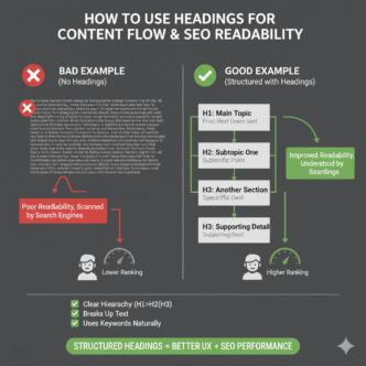
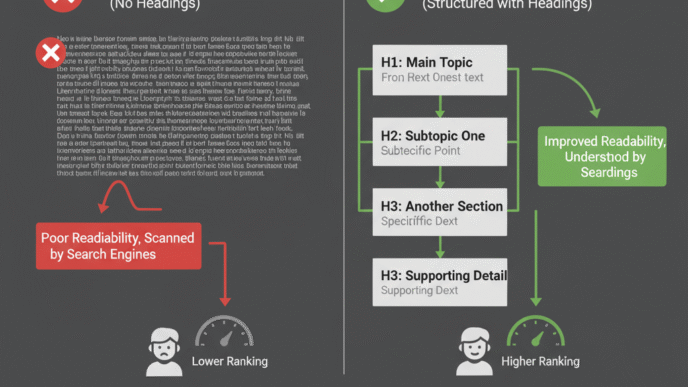
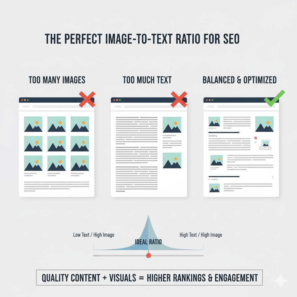
What Exactly Is an Image-to-Text Ratio?
The image to text ratio SEO concept measures the balance between written content and visual elements on a page.
It’s calculated as:
Number of images ÷ Word count = Ratio
Or flipped:
Words per image = Balance metric
Example: A 1,500-word article with 5 images = 300 words per image.
But here’s the kicker: context matters more than the calculation. A product review with comparison photos needs more images than a philosophical essay about stoicism.
Why This Ratio Actually Affects SEO
Images impact SEO through three indirect channels:
- Dwell time: Engaging visuals keep readers on page longer (positive ranking signal)
- Readability: Visual breaks make content scannable, reducing bounce rates
- Accessibility: Proper image optimization helps search engines understand context better
HubSpot’s research found that content with relevant images gets 94% more views than text-only content. More views = more engagement signals = better rankings.
The “Ideal” Ratio: What the Data Actually Says
Spoiler alert: There’s no universal perfect ratio. But patterns exist.
Industry Benchmarks by Content Type
| Content Type | Recommended Ratio | Words Per Image | Why |
|---|---|---|---|
| Blog posts (general) | 1 image per 300-400 words | 300-400 | Breaks up reading without overwhelming |
| How-to guides | 1 image per 150-250 words | 150-250 | Visual steps improve comprehension |
| Product reviews | 1 image per 200-300 words | 200-300 | Buyers need visual proof and comparison |
| News articles | 1 image per 500-700 words | 500-700 | Text-heavy, minimal visual needs |
| Listicles | 1 image per list item | 100-200 | Each point deserves visual reinforcement |
| Case studies | 1 image per 400-600 words | 400-600 | Data visualizations and proof points |
According to an analysis by Backlinko of 1 million Google search results, pages with at least one image rank higher on average—but there’s diminishing returns after 7-8 images for typical blog posts.
The 300-Word Rule: A Practical Starting Point
For most content balance scenarios, aim for one relevant image every 300-350 words.
This gives readers visual breaks without turning your article into a slideshow. It’s not a law—it’s a starting baseline you can adjust based on topic complexity and user intent.
When to Use More Images (and When to Use Fewer)
Use MORE Images When:
Visual learning is critical: Tutorials, recipes, DIY guides, technical documentation. If someone can’t follow along without visuals, pack them in.
Comparison is key: Product roundups, before/after transformations, A/B test results. Show, don’t just tell.
Data needs visualization: Charts, graphs, infographics make complex information digestible. A table of numbers gets ignored; a well-designed graph gets shared.
User intent demands proof: E-commerce, testimonials, portfolio work. Trust requires visual evidence.
Expert Opinion: “For complex tutorials, I use 1-2 images per step, sometimes more. The goal isn’t a perfect ratio—it’s zero confusion.” — Brian Dean, Backlinko Founder
Use FEWER Images When:
Content is opinion/analysis-driven: Deep think pieces, editorials, philosophical discussions don’t need visual interruption every 200 words.
Text IS the value: Legal content, academic writing, detailed policy explanations. Sometimes words carry the weight.
Page speed is critical: Every image adds load time. If you’re fighting for Core Web Vitals scores, be selective.
Images would be filler: Stock photos that don’t add context are worse than no images. Generic “person pointing at graph” photos scream “content mill.”
How Image Placement Affects User Engagement
Where you put images matters as much as how many you use.
The Hero Image: Your First Impression
Every page needs a strong featured image near the top. It sets the tone and gives scanners an instant context clue.
According to eye-tracking studies by Nielsen Norman Group, users fixate on images first, then scan surrounding text. Put your best visual asset front and center.
For more on optimizing hero images and other visual elements, check out our guide on mastering on-page SEO elements.
Section Break Images: The Scannable Structure
Place images between major sections as visual palate cleansers. They signal “new topic ahead” and give eyes a rest.
Bad placement: Randomly scattering images mid-paragraph Good placement: Aligning images with H2/H3 transitions
Inline Contextual Images: Supporting Evidence
Screenshots, data visualizations, and example images work best right next to the text they illustrate. Don’t make readers scroll to find the visual you’re referencing.
Real-World Example: Optimizing Image Balance for 156% Traffic Growth
A SaaS client had a knowledge base with stellar technical content—and zero visual structure. Average time on page: 47 seconds. Bounce rate: 71%.
The problem: 2,000+ word guides with maybe one header image. Pure text walls.
The fix:
- Added section break images every 350-400 words (relevant screenshots and diagrams)
- Created custom infographics for complex concepts
- Inserted annotated screenshots for step-by-step processes
- Optimized all images with descriptive file names and alt text
Results after 8 weeks:
- Average time on page jumped to 3 minutes 22 seconds
- Bounce rate dropped to 43%
- Organic traffic increased 156%
- Pages ranking in top 10 grew from 23 to 61
This wasn’t about hitting a magic ratio—it was about making dense technical content actually usable.
Common Image-to-Text Balance Mistakes
Mistake #1: Treating All Content Types the Same
A 500-word news brief doesn’t need five images. A 2,000-word tutorial probably needs fifteen. Context > formula.
Mistake #2: Using Images as Filler
That random stock photo of diverse people shaking hands? It’s not helping. Every image should serve a purpose: illustrate a point, provide proof, or break up dense sections.
Learn more about avoiding filler content in our comprehensive on-page SEO guide.
Mistake #3: Ignoring Mobile Layout
Images that look perfect on desktop can wreck mobile layouts. Test your content balance on actual phones—not just responsive preview mode.
Mistake #4: Forgetting About Page Speed
Ten uncompressed 2MB images will tank your Core Web Vitals faster than you can say “page abandonment.” Optimize every single image file.
Check out our detailed guide on how file names and image formats affect SEO performance for compression strategies.
Mistake #5: Neglecting Image SEO Basics
Relevant images don’t help SEO if they’re named IMG_4829.jpg with no alt text. Optimize every visual element properly.
The Dwell Time Connection: How Visuals Keep Readers Around
Dwell time—how long users stay on your page before returning to search results—is a critical ranking signal.
A study by SEMrush analyzing ranking factors found that pages with longer average visit duration correlate strongly with higher rankings.
How do images help?
- Pattern interruption: Visuals break the hypnotic scroll and force attention shifts
- Cognitive rest: Reading is work; looking at images provides micro-breaks
- Comprehension boost: Complex ideas click faster with visual support
- Scroll incentive: Users scroll past images to see what’s below
A well-balanced page with strategic image placement can increase dwell time by 40-60% compared to text-only equivalents.
Pro Tip: Use heat mapping tools like Hotjar or Microsoft Clarity to see exactly where users stop scrolling. Add images right before common drop-off points.
How to Audit Your Current Image-to-Text Balance
Step 1: Pick 10 of your top-performing pages and 10 underperforming pages.
Step 2: Count total word count and total images for each.
Step 3: Calculate words per image ratio.
Step 4: Compare ratios against engagement metrics (bounce rate, time on page, scroll depth).
Step 5: Look for patterns. Do your best pages have similar ratios? Do text-heavy pages perform worse?
Tools like Screaming Frog can crawl your site and export image counts per page alongside word counts for bulk analysis.
Quick Wins: Improving Your Visual Balance Today
- Add a featured image to every post that lacks one (aim for 1200x630px minimum)
- Break up long sections with relevant visuals every 300-400 words
- Replace generic stock photos with custom screenshots, diagrams, or data viz
- Optimize all images for file size and add descriptive alt text
- Test mobile layout to ensure images enhance (not disrupt) readability
For deeper optimization strategies, explore our resource on mastering on-page SEO elements.
FAQ: Image to Text Ratio SEO
Q: Is there an official Google recommendation for image-to-text ratios?
No. Google doesn’t specify a ratio. Focus on user experience—if your content is scannable, engaging, and satisfies search intent, you’re on the right track.
Q: Can too many images hurt my SEO?
Indirectly, yes. Too many unoptimized images slow page speed (hurting Core Web Vitals) and can create a thin-content perception if text suffers. Balance is key.
Q: Should every blog post have the same number of images?
Absolutely not. A 500-word news update needs far fewer images than a 3,000-word ultimate guide. Let content type and user intent dictate your approach.
Q: Do GIFs and videos count toward the ratio?
They serve similar engagement functions but with different SEO considerations. Videos especially can boost dwell time significantly—just optimize for load times.
Q: What if my niche is text-heavy (legal, academic, etc.)?
Use fewer images, but be strategic with the ones you include. Even text-heavy niches benefit from data visualizations, process diagrams, or visual examples every 500-700 words.
Q: How do I know if my current balance is working?
Check Google Analytics for bounce rate, average time on page, and scroll depth. Compare text-heavy pages against balanced pages to spot patterns.
Final Thoughts: Stop Counting, Start Connecting
The image to text ratio SEO debate is really about one thing: Does your content keep humans engaged long enough to get value from it?
There’s no magic number. A tutorial needs different visual density than a think piece. E-commerce pages require different balance than news articles.
Start with the 300-word guideline. Adjust based on content type. Optimize every image properly. Monitor engagement metrics.
And for the love of user experience, stop using that generic stock photo of the person pointing at a laptop screen. We’ve all seen it. It helps no one.
Now go audit your top pages, find the gaps, and fill them with visuals that actually matter.
Want to master every aspect of on-page optimization? Dive into our comprehensive guide on mastering on-page SEO elements for proven strategies that move the needle.