Your desktop site is beautiful. Fast. Perfectly optimized. Rankings? Tanking anyway.
Welcome to mobile-first indexing—where Google judges your entire site based on the mobile version, regardless of how stellar your desktop experience looks. If your mobile site is broken, slow, or missing content, your desktop perfection becomes irrelevant. Google doesn’t care about what desktop users see anymore. They care about what mobile users experience.
The shift happened gradually between 2018-2021, but by March 2021, Google completed full mobile-first indexing rollout. Every site—100% of them—now gets crawled and indexed based on mobile content first. According to Google’s official documentation, Googlebot now primarily uses the smartphone agent for crawling, indexing, and ranking.
Here’s the uncomfortable reality: StatCounter’s 2024 data shows 63% of global web traffic comes from mobile devices. Yet according to Search Engine Journal’s mobile SEO study, 47% of websites still deliver inferior mobile experiences compared to desktop—missing content, slower speeds, or broken functionality. These sites hemorrhage rankings while wondering what went wrong.
Mobile SEO isn’t a separate discipline anymore—it’s the foundation. Your mobile site is your primary site in Google’s eyes. Desktop is secondary. This guide ensures Google sees exactly what you want them to see when they crawl your site’s mobile version.
Table of Contents
ToggleWhat Is Mobile-First Indexing?
The Fundamental Shift
Mobile-first indexing means Google predominantly uses the mobile version of content for indexing and ranking. Previously, Google crawled desktop versions primarily, using mobile as a secondary signal. That relationship inverted completely.
When Googlebot crawls your site now, it arrives pretending to be a mobile browser. It sees whatever mobile users see—mobile layout, mobile content, mobile speed. That experience determines your rankings for all searches, mobile and desktop alike.
This isn’t about mobile users getting different results than desktop users. Everyone gets the same results, but those results are determined by how sites perform on mobile. Your technical SEO fundamentals must prioritize mobile experience or risk systematic ranking decline.
Why Google Made This Change
Mobile search volume surpassed desktop in 2015 and never looked back. Google’s algorithm adapting to reflect actual user behavior was inevitable. Indexing based on what most users experience simply makes sense—desktop-first indexing became anachronistic once mobile dominated traffic.
The change also simplified Google’s crawling. Maintaining separate desktop and mobile indexes was inefficient. Mobile-first indexing consolidated everything to one index based on the version that matters most to users.
Desktop vs Mobile Indexing Impact
Previously, strong desktop sites could rank well despite weak mobile experiences. Mobile-first indexing eliminated that safety net. If your mobile site is inferior to desktop, you’re now indexed and ranked based on the inferior version.
Conversely, if your mobile experience is strong, you benefit even when users search from desktop. The mobile version’s quality determines desktop rankings too. This creates powerful incentives to prioritize mobile optimization regardless of your audience’s device distribution.
Responsive Design vs Separate Mobile Sites
Responsive Design (Recommended)
Responsive design uses CSS and flexible layouts to adapt to different screen sizes with one codebase and one URL structure. Content, HTML, and URLs remain identical across devices—only presentation changes.
<meta name="viewport" content="width=device-width, initial-scale=1">
Google strongly recommends responsive design because it’s simpler to crawl one URL rather than tracking separate mobile and desktop versions. It eliminates duplicate content concerns and requires no special annotations. According to Google’s mobile guide, responsive design is the easiest approach for mobile-first indexing compliance.
Your technical SEO implementation becomes dramatically simpler with responsive design—no separate sitemaps, no alternate tag complexity, no mobile-specific canonicals.
Separate Mobile URLs (m.example.com)
Separate mobile sites use different URLs for mobile (m.example.com) and desktop (www.example.com) versions. This approach creates implementation complexity through required rel=”alternate” and rel=”canonical” annotations plus potential duplicate content issues.
<!-- Desktop page -->
<link rel="alternate" media="only screen and (max-width: 640px)"
      href="https://m.example.com/page">

<!-- Mobile page -->
<link rel="canonical" href="https://www.example.com/page">
While technically viable, separate mobile URLs require meticulous annotation maintenance. Any missed annotations risk duplicate content or incorrect indexing. Most organizations migrating from separate mobile sites to responsive design see simplified management and improved indexing clarity.
Dynamic Serving
Dynamic serving delivers different HTML based on user agent while maintaining the same URL. The server detects device type and serves mobile or desktop HTML accordingly.
This approach requires Vary: User-Agent HTTP headers telling Google the content changes based on user agent. Without proper headers, Google might cache desktop content for mobile users or vice versa. Implementation complexity exceeds responsive design without meaningful benefits for most sites.
Mobile Usability Requirements
Viewport Configuration
Proper viewport configuration is non-negotiable. Without it, mobile browsers render sites at desktop widths, forcing users to pinch and zoom.
<meta name="viewport" content="width=device-width, initial-scale=1">
This meta tag tells browsers to match screen width and start at 100% zoom. Every page needs this tag. According to Google’s mobile-friendly testing guide, missing or misconfigured viewport tags are the most common mobile usability errors.
Text Readability
Text must be readable without zooming. Google recommends 16px base font size for body text. Smaller text creates poor user experiences and may trigger mobile usability warnings in Search Console.
body {
  font-size: 16px;
  line-height: 1.5;
}
Line height should be 1.5x font size minimum for comfortable reading. Contrast ratios between text and backgrounds should meet WCAG AA standards (4.5:1 for body text).
Touch Target Sizes
Buttons and links need sufficient size and spacing for touch interaction. Google recommends 48×48 CSS pixels minimum for touch targets, with 8px spacing between them.
.button {
  min-height: 48px;
  min-width: 48px;
  padding: 12px 24px;
}
Tiny touch targets frustrate users and lower engagement signals Google tracks. Nielsen Norman Group research confirms touch targets below 44×44 pixels significantly increase error rates.
Content Width and Horizontal Scrolling
Content must fit screen width without horizontal scrolling. Fixed-width elements exceeding viewport width break mobile usability fundamentally.
img, video {
  max-width: 100%;
  height: auto;
}
Images and videos should scale responsively. Tables require special handling—either make them responsive or allow horizontal scrolling with clear visual indicators.
Content Parity Between Mobile and Desktop
The Content Parity Principle
Google indexes content from your mobile version. If content exists on desktop but not mobile, Google might not see it—meaning it won’t be indexed or ranked. Content parity ensures consistent indexing regardless of version Google crawls.
This was critical during mobile-first indexing rollout when many sites hid content on mobile for “better UX.” Those sites lost rankings for keywords related to hidden content. Google can only rank what it can crawl and index.
Common Content Hiding Mistakes
Accordion menus and tabs that hide content initially were problematic early in mobile-first indexing. Google improved at processing JavaScript-hidden content, but content visible by default is still safest.
<!-- Risky: Content starts hidden -->
<div class="accordion" style="display:none;">Hidden content</div>

<!-- Safer: Content visible by default -->
<div class="accordion">Visible content</div>
Complete content removal on mobile is catastrophic. Never hide entire sections of valuable content solely on mobile—especially content targeting important keywords.
Structured Data Consistency
Structured data markup should be identical across mobile and desktop. Missing schema on mobile while present on desktop can lose rich snippet eligibility and rankings.
Audit your mobile and desktop versions comparing schema markup. Every page should have identical structured data regardless of how users access it. Your technical SEO strategy must mandate schema consistency across device types.
Image and Media Parity
Images should be accessible on mobile even if sizing differs. Don’t remove images entirely—just make them responsive. Alt text must be identical across versions since Google uses alt text for image indexing.
<img src="image.jpg"
     srcset="image-small.jpg 640w, image-large.jpg 1280w"
     alt="Descriptive alt text">
Responsive images using srcset serve appropriate sizes per device while maintaining SEO value through consistent alt text and accessibility.
Page Speed and Core Web Vitals
Mobile Performance Requirements
Mobile sites must load quickly despite slower connections and less powerful processors. Google’s Core Web Vitals—LCP, FID, CLS—apply to mobile crawling and ranking.
Target metrics for mobile: LCP under 2.5 seconds, FID under 100 milliseconds, and CLS under 0.1. These thresholds define “good” user experience by Google’s standards. According to Google’s Core Web Vitals documentation, 75% of page loads must meet these thresholds.
Reducing Mobile Page Weight
Mobile connections have limited bandwidth. Pages exceeding 1-2MB frustrate users and harm rankings. Optimize images aggressively—compress, use modern formats (WebP), and implement lazy loading.
<img src="image.jpg" loading="lazy" alt="Description">
Minimize JavaScript and CSS. Third-party scripts are notorious page weight offenders—audit every external resource for necessity. Remove what doesn’t serve users directly.
Lazy Loading Implementation
Lazy loading defers offscreen content until users scroll near it. This improves initial load times dramatically while maintaining full content accessibility.
<img src="placeholder.jpg"
     data-src="actual-image.jpg"
     loading="lazy"
     alt="Description">
Modern browsers support native lazy loading through the loading="lazy" attribute. For older browsers, JavaScript libraries like lazysizes provide polyfills. Google crawls lazy-loaded content when implemented correctly per their lazy-loading guidance.
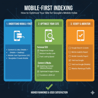
Mobile SEO Technical Checklist
Search Console Mobile Usability Report
Google Search Console’s Mobile Usability report flags pages with mobile experience problems. Common issues include text too small, clickable elements too close, content wider than screen, and viewport not set.
Check this report weekly minimum. New errors indicate recent changes broke mobile experience. Address errors immediately before they accumulate and damage rankings.
Mobile-Friendly Testing Tool
Google’s Mobile-Friendly Test analyzes individual URLs, showing how Googlebot sees your page on mobile. Use it to verify new pages meet mobile standards before publishing.
The tool shows rendered page screenshots from mobile perspective, flagging specific usability issues. It’s instant feedback on whether your implementation works correctly.
PageSpeed Insights Mobile Analysis
PageSpeed Insights provides separate mobile and desktop performance scores. Focus primarily on mobile scores—that’s what Google uses for indexing.
The tool suggests specific optimizations: compress images, eliminate render-blocking resources, minimize CSS/JS, leverage browser caching. Prioritize suggestions with highest estimated time savings.
Crawl Rate and Coverage Monitoring
Monitor crawl stats in Search Console after mobile-first indexing migration. Crawl rates should remain stable or increase—decreases suggest problems preventing efficient crawling.
Check Index Coverage for mobile-specific errors. Pages indexed on desktop but not mobile indicate content parity or mobile usability issues requiring investigation.
Fixing Common Mobile-First Indexing Issues
Content Mismatch Between Versions
When desktop has more content than mobile, Google can’t index what it can’t see. Audit both versions systematically comparing content, structured data, internal links, and images.
Use tools like Screaming Frog to crawl both desktop and mobile versions, then compare outputs identifying discrepancies. Every meaningful desktop element should exist on mobile, possibly formatted differently but present nonetheless.
Slow Mobile Loading Times
If mobile loads significantly slower than desktop, Core Web Vitals suffer and rankings decline. Profile mobile performance using Chrome DevTools device emulation throttled to slow 4G.
Common culprits include unoptimized images, excessive JavaScript, render-blocking resources, and third-party scripts. Implement performance budgets limiting page weight and script execution time.
Interstitials and Pop-ups
Intrusive interstitials covering main content on mobile trigger penalties. Google explicitly disfavors full-page interstitials on mobile that obstruct content access.
<!-- Problematic: Full-screen interstitial -->
<div class="interstitial" style="position:fixed; top:0; left:0; width:100%; height:100%;">

<!-- Better: Non-intrusive banner -->
<div class="banner" style="position:relative; width:100%; padding:10px;">
Use smaller, dismissible banners instead of full-screen overlays. If interstitials are necessary, delay them until users engage with content or implement exit-intent triggers only.
Mobile Redirect Errors
Incorrect mobile redirects send users to wrong pages—desktop homepage instead of mobile equivalent of internal page. This creates terrible user experience and harms mobile SEO.
Bad: example.com/product/shoes → m.example.com (homepage)
Good: example.com/product/shoes → m.example.com/product/shoes
Implement equivalent URL redirects maintaining page-level correspondence between desktop and mobile versions. Test redirects thoroughly across your site’s structure.
Preparing for Mobile-First Index Migration
Pre-Migration Audit
Before Google switches your site to mobile-first indexing (if they haven’t already), audit mobile readiness comprehensively. Compare mobile and desktop versions for content differences, structured data presence, meta tag consistency, internal linking structures, and performance metrics.
Document every discrepancy. Create prioritized fix list addressing ranking-critical issues first—missing content, broken functionality, severe performance problems.
Testing Mobile Googlebot Crawling
Use Search Console’s URL Inspection tool testing how Googlebot (mobile) sees your pages. This shows exactly what Google indexes from mobile perspective.
Compare against URL Inspection for Googlebot (desktop). Differences indicate potential mobile-first indexing issues requiring resolution before Google migrates your site.
Monitoring the Transition
Google Search Console sends notifications when sites migrate to mobile-first indexing. Monitor Search Console messages closely for this notification plus any warnings about mobile usability or content problems.
After migration notification, watch rankings and traffic for anomalies. Expect minor fluctuations initially—this is normal as Google reprocesses your site. Sustained drops beyond 10-15% suggest mobile implementation problems requiring urgent attention.
Advanced Mobile Optimization
Accelerated Mobile Pages (AMP)
AMP creates stripped-down mobile pages that load extremely fast. While not required for mobile-first indexing, AMP can provide competitive advantages through Top Stories carousel eligibility and faster mobile loading.
AMP requires separate page versions with restricted HTML and mandatory JavaScript frameworks. Complexity exceeds responsive design, but performance gains benefit news sites and content publishers.
Google states AMP isn’t a ranking factor directly, but the speed improvements indirectly benefit rankings through better user experience signals and Core Web Vitals performance.
Progressive Web Apps (PWA)
PWAs combine web and native app advantages—installability, offline functionality, push notifications—while remaining accessible through browsers without app store downloads.
PWAs enhance mobile user experience significantly but require service worker implementation and manifest files. For e-commerce and content sites with engaged audiences, PWAs can dramatically improve retention and conversion.
App Indexing
If you have native mobile apps, app indexing lets Google surface in-app content in search results for users with apps installed. This expands mobile visibility beyond web pages.
Implement app indexing through deep links connecting web URLs to app screens. Users searching on mobile with your app installed can jump directly to app content from search results.
Real-World Mobile-First Indexing Impact
A B2B SaaS company maintained separate mobile and desktop sites for years. Their mobile site (m.example.com) had abbreviated product descriptions, no blog content, and simplified navigation compared to their desktop site.
When Google migrated them to mobile-first indexing, rankings plummeted for their primary keywords—searches where blog content and detailed product specs previously drove visibility. Over 8 weeks, organic traffic dropped 43%, with mobile and desktop traffic both declining since mobile indexing affected all results.
Investigation revealed Google now indexed their abbreviated mobile content exclusively. Detailed product features explaining competitive advantages? Not indexed. Blog posts establishing thought leadership? Not indexed. The content existed on desktop but was invisible to Google’s mobile-first crawler.
They migrated to responsive design, bringing full content parity across devices. Implementation took 6 weeks including thorough testing. Rankings began recovering immediately, with full traffic restoration after 12 weeks post-launch.
Final results after 6 months: 8% organic traffic increase over pre-crisis levels, attributed to improved mobile experience boosting both mobile-specific rankings and overall quality signals.
Lesson: Content parity isn’t optional. Whatever you want Google to index must exist on mobile, accessible to mobile crawlers, rendered identically to desktop even if styled differently.
FAQ: Mobile-First Indexing
Does mobile-first indexing mean mobile rankings are separate from desktop?
No, there’s only one index. Mobile-first means Google determines rankings based on mobile content, but those rankings apply to all searches regardless of device. Strong mobile experience improves rankings for desktop users too. The indexing is mobile-first, not mobile-only.
Do I need a separate mobile site for mobile-first indexing?
No, responsive design with one URL serving all devices is recommended. Separate mobile sites (m.example.com) work but create complexity through required annotations and duplicate content risks. Most sites benefit from migrating to responsive design for simpler mobile-first indexing compliance.
How do I know if my site has switched to mobile-first indexing?
Check Google Search Console for migration notification. Additionally, inspect server logs—if Googlebot smartphone is your primary crawler (not desktop), you’ve migrated. By 2024, essentially all sites use mobile-first indexing, so assume yours does unless evidence suggests otherwise.
Will my rankings drop after mobile-first indexing?
Only if your mobile experience is inferior to desktop. Sites with content parity, good mobile usability, and strong mobile performance typically see stable or improved rankings. Drops indicate mobile implementation problems—missing content, poor usability, or slow loading requiring fixes.
What if most of my traffic comes from desktop?
Doesn’t matter. Google indexes based on mobile content regardless of your actual traffic distribution. Even if 90% of visitors use desktop, your mobile implementation determines rankings. Optimize for mobile first, then enhance desktop experience as secondary priority.
Final Verdict: Mobile Is Your Primary Site
Mobile-first indexing isn’t coming—it’s here, universal, and non-negotiable. Every site Google crawls uses mobile-first indexing now. Your mobile experience isn’t an afterthought or separate concern—it’s the foundation determining all search visibility.
Your checklist: ensure responsive design or proper mobile annotations, verify content parity between mobile and desktop, optimize mobile page speed and Core Web Vitals, fix mobile usability errors in Search Console, test with Mobile-Friendly testing tool, and monitor mobile crawling patterns.
Test everything on actual mobile devices, not just desktop browsers pretending to be mobile. Real-world mobile experiences reveal problems desktop simulation misses—slow connections, touch interactions, smaller screens.
Your competitors either adapted to mobile-first indexing already or will soon. Being last to optimize means falling behind permanently in rankings determined by mobile quality. The desktop-first world ended years ago—time to catch up or get left behind.
Master mobile optimization as part of comprehensive technical SEO fundamentals, and you’ve aligned with Google’s primary ranking criteria. Desktop excellence without mobile parity is SEO malpractice in 2025’s mobile-first reality.
Mobile-First Indexing Control Panel
Optimize your site for Google's mobile index with real-time testing and comprehensive checklists
Desktop vs Mobile Traffic Distribution
Ranking Impact by Mobile Experience Quality
Core Web Vitals for Mobile
Mobile-Friendly Test
Mobile Optimization Checklist
Add <meta name="viewport" content="width=device-width, initial-scale=1">
Mobile should have all content present on desktop version
Single URL serving all devices is simplest approach
Avoid forcing users to zoom for reading
Ensure buttons and links are easily tappable
Use WebP format and loading="lazy" attribute
Compress assets and minimize third-party scripts
Address all issues in Mobile Usability report
Schema markup should be identical on mobile and desktop
Actual devices reveal problems desktop simulation misses
Your Optimization Progress
Click checklist items above to track your mobile optimization progress


